stefan sagmeister
Sagmeister, probably best known for his collection of books, "Things I have learned in my life so far" is a designer, who, like the others i've talked about, approaches typography and imagery as an interesting combination.
stefan sagmeister might seem a jump from large design companies but in my journey of approaches to type i think sagmeister can slip in after non format. now M&M paris use images to create letterforms, as do non format, however stefan takes this image/type collaboration a step further. sagmeister uses photography to capture his designs that build typography into the real world. whether this be through sculpture, instillation, or taking advantage of the environment and actually forming the letters out of what’s already there. sagmiester’s photographs are captivating, again at first glance some look like co incidence but again, tremendous amounts of strict regulations are in place to ensure the designs are achieved as desired and make sure they look at natural as possible.

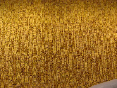
this installation ( above & below) using bananas shows just how much work and planning goes into some of Sagmeister's design. This piece also explains how he often puts his typography into the real world, using real objects to create it and then by using his photography, turns the typographical structure, into an image.
As with M&M and Nonformat, some of Sagmeister's work on initially looking at it would appear to be as if it had always been this way, a naturally occurring piece of design ( the way the branches of a tress happen to grown , or the coincidental arrangement of fallen objects. However, pieces of this scale and magnitude take excruciating planning and regulations in order to achieve this "natural" effortless appearance.

"this 1999 AIGA Detroit poster (above) typifies Stefan Sagmeister’s style. Striking to the point of sensationalism and humorous but in such an unsettling way that it’s nearly, but not quite unacceptable, his work mixes sexuality with wit and a whiff of the sinister. Sagmeister’s technique is often simple to the point of banality: from slashing D-I-Y text into his own skin for the AIGA Detroit poster, to spelling out words with roughly cut strips of white cloth for a 1999 brochure for his girlfriend, the fashion designer, Anni Kuan. The strength of his work lies in his ability to conceptualise: to come up with potent, original, stunningly appropriate ideas."
the 3 pictures (above) taken from "things i have learned in my life so far" are again examples of Sagmeister putting his typography into the real world and through photography creating interesting and unusual imagery.
"for a long time we prided ourselves not to have a style
which to uphold became impossible. this is because if you
really switch your stylistic approach from project to project
it is impossible to come up with a new one on a weekly or
monthly basis, without ripping-off either historical styles or a
particular designers' style. although it would not cover all of
our work I would say we are probably best known for our
hand-made quality." Stefan Sagmeister on his own style of design
this piece below is my favourite. this was an instillation in Holland made of coins. to me this is a perfect example of how he has the ability to merge type and image into something really beautiful.


No comments:
Post a Comment