Thursday 29 October 2009

hoefler and frere jones


examples of serif fonts created by H&FJones


hoefler and frere jones

Since 1989 H&FJones have been designing type. Over these years they have created type solutions for some well known publications such as Rolling Stone magazine, Harper's Bazaar, The New York Times Magazine, Sports Illustrated, and Esquire.Hoefler and Frere-Jones were also the first type designers to be recognized by the National Design Awards, being that their Gotham typeface was recently selected for the cornerstone of the Freedom Tower, the building on the site of the twin towers site.

after 20 years of designing type who can blame Jonathan Hoefler & Tobias Frere-Jones for being ridiculously in-depth with their research and analysis of typography for each and every typeface they design. hoefler and frere jones have a similar approach then to Bibliotheque, if you recall the quote from the designers at Bibliotheque
"Our design methodology is based on analysis and research"
both design groups have the same ideology towards typography. that it be functional, clean, clear exact and beautifully crafted.

Hoefler & Frere JOnes are intense about typography. there intensity, to anyone who isnt of the same mind, could seem extreme and unnecessary, but to them, it is fundamental in creating great typefaces.

typography can be approached in many ways from M&M's extremely hand made textured approach right across to these guys and there intense desire for typographical perfection. Each is completely valid and each have very similar production methods in terms of setting rules

and abiding by there desires regulations.


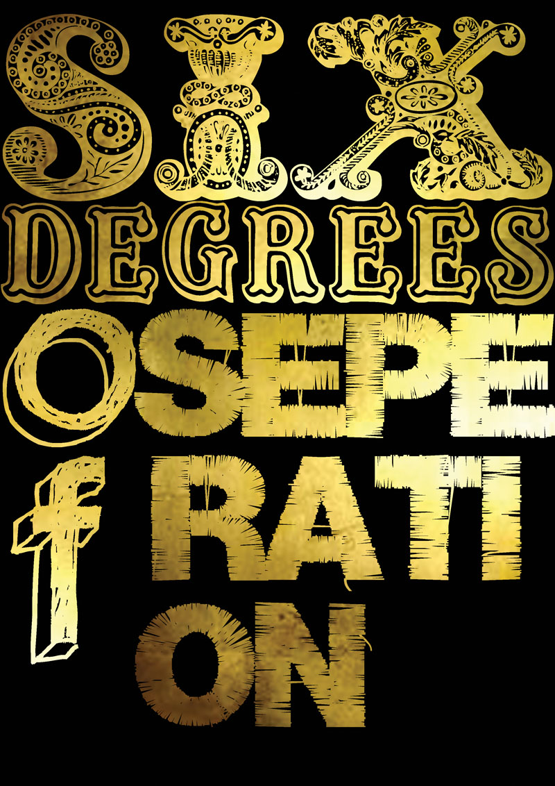
Throughout these six degrees of separation i have taken a journey through 6 design companies connecting them through the ways in which they approach and design type. Each company is different, they each have their own ideals and ways of working, and each of course have their own styles, but what runs through them all is they all go through some kind of research. Wether that be spontaneously photographing random pieces of interest and then analysing these images to create themes and shapes or whether the research is far more structured such and bibliotheque and H&F Jones.


(above) are the photographs taken on a H&F Jones typographical walk through New York City to collect research for their typeface Gotham which is bases on American architectural sinage
the 2 above and 2 below are artboards created for archer typeface.
Sweet but not saccharine, earnest but not grave, Archer is designed to hit just the right notes of forthrightness, credibility, and charm.


Bibliothèque


Bibliothèque

design consultancy based in Shore-ditch, Bibliotheque is my next step towards hoeufler and frere jones. So far in my journey i've talked about M&M Paris and their use of images to create letterforms. From there i looked at NOn format who i discussed used similar rationale in their work, transforming images into letterforms. Next Stefan Sagmeister, who bore some similarities to the previous two in that the relationship he created between type and image was very close, but he differed in the application, tending more towards instillation of type into the real world in a beautifully designed way, thusly creating an image. Following on from him i looked at David CArson, who very much uses typography to create abstract and unusual imagery the opposite to the others). And now onto Bibliotheque. They might seem a long way apart but my line of thinking in linking them is that David Carson uses type to create images in a sometimes illegible way, as the design to Carson is more important than the functionality of the typography. however Bibliotheque, also using typography as a major part of their designs, flip Carson's approach and use typography is a very functional, clear, crisp way, as functionality of typography is very important in their designs.

"Our design methodology is based on analysis and research. We deliver clear, relevant and thought-

provoking communications, regardless of scale or budget. We have a varied list of clients from a wide range of sectors. "


(above) A major exhibition at the V&A tracking the development of design throughout the Cold War, as the Soviet Union and America engaged in an aggressive contest to build their own spheres of influence. The exhibition features a wide array of artists and designers of the period including
Dieter Rams, Otl Aicher, Charles Eames, Le Corbusier and Stanley Kubrick.


An identity was required to help Covent Garden achieve its goal of being
a premiere retail and lifestyle destination for London.

"The geometric nature of the logo provides a visual language based on the use of concentric circles. This

has been applied across an array of assets, from street signage and marketing literature through to digital environments, packaging and advertising. Many individual projects are currently in development, and will be realised as Covent Garden is transformed over the coming years."


(above) A new identity to develop the brand profile of CAA –
the largest and most successful gallery and retail outlet
for contemporary craft in London and the UK. Bags, stationery, artists cards, invitations and signage were
all part of the design.


Wednesday 28 October 2009

david carson


david carson

my link from sagmeister to david carson is not via their similarities but by their contrasting approaches to type. as previously discussed, sagmeister and non format and M&M all use images to create letterforms in one way or another however in contrast david carson primarily uses type and letterforms to create images.

carson's very distinctive approach to typography is easily recognizable, perhaps because he is seen to be doing things “ the wrong way round. i have chosen to Link David carson into my journey as a contrast in approach to the other designers i've compared. So we had M&M and Nonformat using images to create letterforms. Sagmeister creating imagery out of real life typography instilations, and now david carson, who in contrast uses primarily typography to create his images, the opposite way round the the previous designers.

"Since the early nineties, the best-known practitioner of innovative visual and graphic design-- whose work is often described as the new typography, deconstructive typography, or digital typography -- has been David Carson"

He gave us 'dirty' graphics, and was dubbed the 'godfather of grunge'. Carson questioned the aesthetics and purpose of typography and not only broke the rules He abandoned the usual conventions of the grid system and ignored the acceptable usage of columns, headlines and even page numbers. This resulted in a style which was chaotic and abstract in the extreme, often unreadable, but always visually exciting.


examples (above) of Carson's experimental typography , creating interesting imagery using the word 'yes'


these abstract pieces blend type into
image in a way that although breaking the 'normal' rules of typography appearing to have no real structure to them, will have their own grid system that allows
for this image based spontaneous layout while still following layout guidelines of design.


Below are some other examples of Carson's work, showing how he has, in contrast to the other designers so far, used type to create an image.


stefan sagmeister


stefan sagmeister

Sagmeister, probably best known for his collection of books, "Things I have learned in my life so far" is a designer, who, like the others i've talked about, approaches typography and imagery as an interesting combination.

stefan sagmeister might seem a jump from large design companies but in my journey of approaches to type i think sagmeister can slip in after non format. now M&M paris use images to create letterforms, as do non format, however stefan takes this image/type collaboration a step further. sagmeister uses photography to capture his designs that build typography into the real world. whether this be through sculpture, instillation, or taking advantage of the environment and actually forming the letters out of what’s already there. sagmiester’s photographs are captivating, again at first glance some look like co incidence but again, tremendous amounts of strict regulations are in place to ensure the designs are achieved as desired and make sure they look at natural as possible.


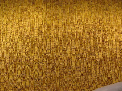
this installation ( above & below) using bananas shows just how much work and planning goes into some of Sagmeister's design. This piece also explains how he often puts his typography into the real world, using real objects to create it and then by using his photography, turns the typographical structure, into an image.


As with M&M and Nonformat, some of Sagmeister's work on initially looking at it would appear to be as if it had always been this way, a naturally occurring piece of design ( the way the branches of a tress happen to grown , or the coincidental arrangement of fallen objects. However, pieces of this scale and magnitude take excruciating planning and regulations in order to achieve this "natural" effortless appearance.


"this 1999 AIGA Detroit poster (above) typifies Stefan Sagmeister’s style. Striking to the point of sensationalism and humorous but in such an unsettling way that it’s nearly, but not quite unacceptable, his work mixes sexuality with wit and a whiff of the sinister. Sagmeister’s technique is often simple to the point of banality: from slashing D-I-Y text into his own skin for the AIGA Detroit poster, to spelling out words with roughly cut strips of white cloth for a 1999 brochure for his girlfriend, the fashion designer, Anni Kuan. The strength of his work lies in his ability to conceptualise: to come up with potent, original, stunningly appropriate ideas."


the 3 pictures (above) taken from "things i have learned in my life so far" are again examples of Sagmeister putting his typography into the real world and through photography creating interesting and unusual imagery.


"for a long time we prided ourselves not to have a style
which to uphold became impossible. this is because if you
really switch your stylistic approach from project to project
it is impossible to come up with a new one on a weekly or
monthly basis, without ripping-off either historical styles or a
particular designers' style. although it would not cover all of
our work I would say we are probably best known for our
hand-made quality." Stefan Sagmeister on his own style of design

this piece below is my favourite. this was an instillation in Holland made of coins. to me this is a perfect example of how he has the ability to merge type and image into something really beautiful.


nonformat


nonformat

i love non format. i absolutely love them. but thats not the reason i’ve chosen to right about them. its because i can draw real similarities between the approach to typography of these guys to that of previously mentioned M&M.


Simplicity. We like to keep things simple. Once we’ve sorted out the hierarchy of what we want to communicate, we tend to design things using very few layers, especially if one of those layers is incredibly detailed and aesthetically busy.


although i can draw major similarities between certain aspects both non format and M&M i in no way think the two are in any way the same. i think successful designers are those who arent afrid to be different and not jump on the band wagon of previously successful companies.


this magazine spread (above) uses tape to create the letterforms. the typography of this piece is very heavily image based, similar to the style of M&M. scanning in the tape or photographing it so that the imperfections, highlights and shadows show through, give the image a textured, grungy, real appearance that is so desirable and appealing in design today.


(above) Vowels "The Pattern Prism" cd packaging for loaf is again a good example of non formats use of images to create letterforms. the abstract shapes used to form the word vowels creates a great piece of imagery as well as very interesting experimental typography.


(2 above)these spreads from very elle magazine show non format using typography to create a very elegant, feminine and sophisticated image, almost like a drawn line. I think this works very well with the articles theme and the magazine style itself.


(2 above) Front cover and feature opener for Print's October 2009 issue. another really image based type design from non format.


(above) image based typography t shirt designs for Gap


Nonformat are individual, although cultured and knowledgeable about what is “hot” in design and what isnt they stand alone. and they value this fact.


“We draw inspiration from many varied sources but we would never want to be too strongly influenced by any single designer. It’s important not to look too closely at what other designers are doing. In fact, it’s a good idea to avoid looking at all.”


Sunday 25 October 2009

M&M Paris


m&m paris


Paris born art and design duo Mathias Augustyniak and Michael Amzalag have, for the past 17 years been creating challenging and contemporary design as M&M Paris.

M&M’s style for design is one that is fast becoming exceedingly desirable within the fashion and branding world. and the reason for this? One of M&M’s ethos like concerns in design is having invented a set of rules or codes to rigidly adhere to in any given project or brief (grid-systems and rules within design are fundamental no matter what the desired feel of the outcome) to then find a way of executing these rules without seeming forced. This way of approaching the fundamentals of design combined with M&M’s methodology of devising new kinds of images by mixing different media such as photography, illustration and experimental typography, makes the design they create distinctive from any other. and in the world of design. the more distinctive, the better.

“everything about M&M’s creative style is distinctive”


their art direction, drawing, photography, typography, 3-D design and mastery of production.There isn't a weak card in their hand, but it's how they play their hand that makes them really interesting." Paul Neale co-founder of the london design studio graphic thought facility.

what m&m paris also do so well is the way they add a hand made feel to their designs like hand drawn elements, ink splats, torn paper, layered photos etc. these destails can make a peice of work look accidental, or spontaneous, but its this clever incorporation of these hand made elements that give M&M’s designs such originality.

M&Ms use of images in order to create type is what really draws me to them as a design student. there striking letter forms made using cut out layered fashion shots are amazing. on first glace the formation of the letters look almost accidental, just a happy accident of layered images. But on reflection the strict rules that M&M will imply in order to formulate these images is very rigid.

its this ability ( or desire) to use images and formulate letterforms is a technique that i really enjoy and for me is what M&M paris do better than most.


the type in this silkscreen film poster uses blocks over layered colour to create the numbers instead of single glyphs.

this other silkscreen film poster ( above) plays with the boundary of image and type by using different parts of the original photograph to colour the type.

you are a democrartist (above) is a great example of the unusual image/type boundaries that M&M have brought to the forefront of design.


the alphabet (above) i think is amazing. the clever way in which the fashion shots have been cut to form the letters while still retaining a really strong fashion photography style. this piece really highlights M&M;s use of images to create typography.
this interview magazine cover designed by M&M shows off their technique of creating hand made looking design.